Exploratory Data Analysis (EDA): Part I
Contents
Exploratory Data Analysis (EDA): Part I
Exploratory Data Analysis (EDA) is the process of acquainting oneself with a dataset, in order to understand the observations it contains and assess those contents with respect to what is understood of the data generating process. Such an initial investigation informs subtle decisions in data cleaning, the sorts of questions the dataset can address, and the scope of events to which the dataset applies.
An EDA immediately follows the basic steps of data cleaning and attempts to succinctly summarize a dataset with easily understandable tables and visualizations.
The start of any EDA begins with visual summaries of each attribute, taking care to describe:
the shape of the data, using distributions,
where most the data lie, using percentiles, and
any outliers that may distort other descriptions.
An EDA should proceed attribute-by-attribute, carefully summarizing the observations described above.
Introduction to Seaborn
Seaborn is a python plotting library that provides a convenient API for plotting common statistical summaries. Seaborn is typically imported as:
import seaborn as sns
The following plots are convenient for understanding the univariate statistics relevant to this section:
distplotplots the distribution of an attribution in three possible ways:a histogram with a specified number of bins,
a density plot to estimate the overall shape of the distribution,
a rug plot that plots individual data points as tick marks (for spotting outliers).
boxplotdisplays the quartiles of an attribute, along with the minimum and maximum values.countplotdisplays the categorical distribution of an attribute as a bar chart.
EDA on the college scorecard data
Recall that the college scorecard data contains individual observations about colleges across the United States. The dataset analyzed below contains a small subset of attributes describing each college.
Included below is a short investigation into two variables in the dataset. A thorough EDA would systematically approach every column.
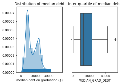
The quantitative attribute MEDIAN_GRAD_DEBT describes the median debt of students at each school upon graduation. The plot of the distribution shows:
Two modes for median student debt near \\(10000 and \\\)26000,
A few colleges with median student debt above \$50000.
The box-plot reveals that approximately 50% of the colleges have median student debt between the two modes seen in the distribution.
fig, (dist, box) = plt.subplots(1, 2)

# distribution plot
dist.set_title('Distribution of median debt')
sns.distplot(
    colleges['MEDIAN_GRAD_DEBT'].values,
    bins=10, hist=True, kde=True, rug=True,
    axlabel='median debt on graduation ($)',
    ax=dist
)

# box plot
box.set_title('Inter-quartile of median debt')
sns.boxplot(colleges['MEDIAN_GRAD_DEBT'], ax=box);
Investigating the outliers shows three colleges with a median debt of over \$50000; two of these colleges are clearly related. This raises a question of data quality: have these schools have pooled their statistics across both campuses? Or are they coincidentally the same?
colleges.loc[colleges.MEDIAN_GRAD_DEBT > 50000]
| COLLEGE_ID | NAME | UNDERGRAD_POP | PCT_FED_LOAN | MEDIAN_GRAD_DEBT | SETTING | |
|---|---|---|---|---|---|---|
| 79 | 2491500 | Southwest University of Visual Arts-Tucson | 125.0 | 0.9242 | 51488.5 | Urban |
| 4122 | 2491501 | Southwest University of Visual Arts-Albuquerque | 66.0 | 0.9277 | 51488.5 | Urban |
| 4619 | 3513400 | Apex School of Theology | 646.0 | 0.9208 | 52000.0 | Urban |
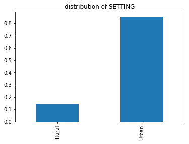
The categorical attribute SETTING describes the environment (urban or rural) in which the college is located. The distribution of settings reveals that approximately 85% of the colleges are located in an urban environment:
(
    colleges['SETTING']
    .value_counts(normalize=True)
    .sort_index()
    .plot(kind='bar', title='Distribution of SETTING')
);